Link Grid
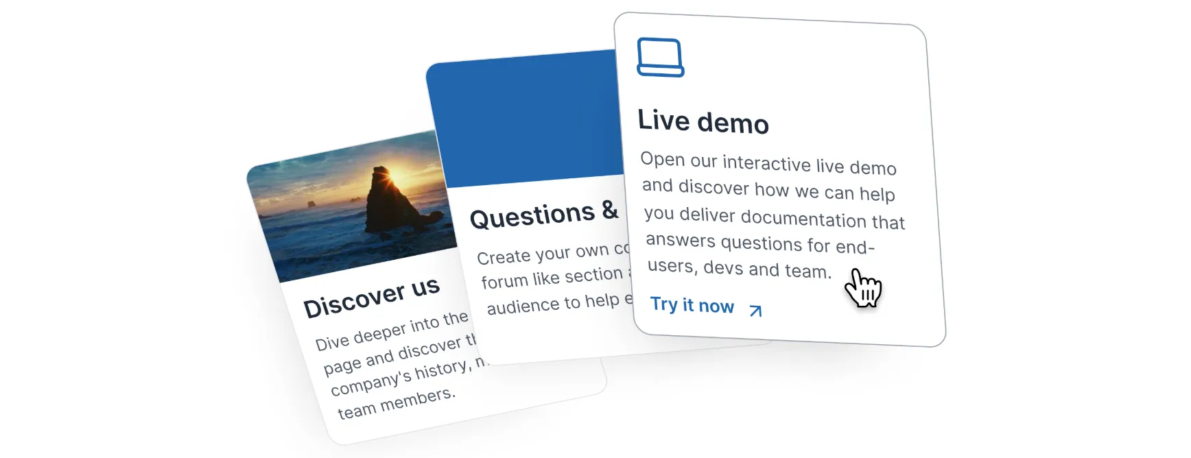
Link Grid is an element that combines the visual appeal of a card with the functionality of a clickable item.
It's perfect for highlighting important information or showcasing related resources.
When to use it
Highlight key information
Create attention-grabbing cards for important announcements or updates.
Showcase related content Link to additional resources, articles, or products.
Create a visually appealing directory
Organize information into clickable cards for easy navigation.
Enhance user experience Provide a clear and interactive way to guide users through your content.
How to create a Link Grid
Type / to open Archbee Block menu
Search for Link Grid and click to insert
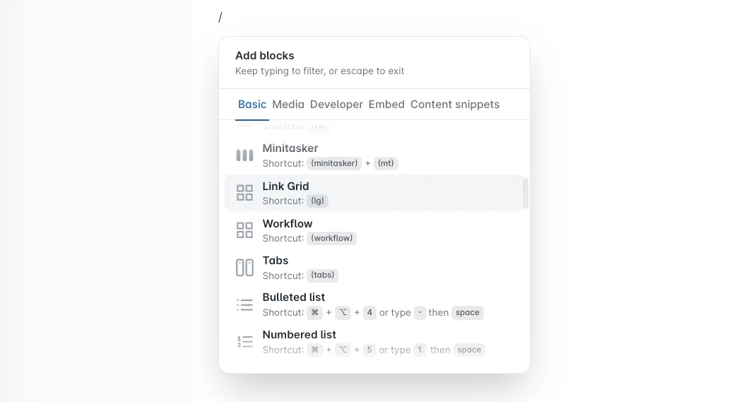
Choose how you want to create it.
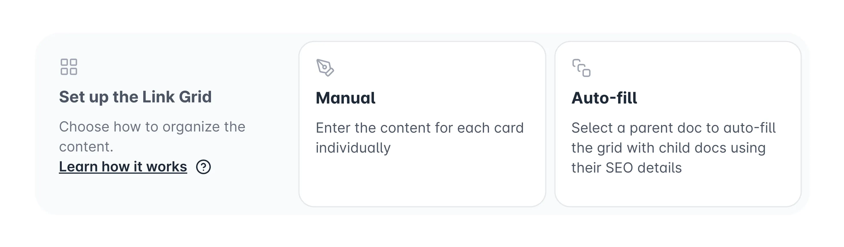
Manual vs. Auto-fill Link Grid
As you continue to write content manually in Link Grid, the next steps are:
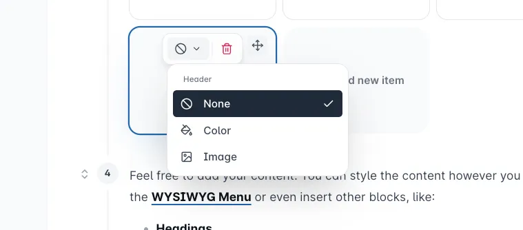

Solid color header
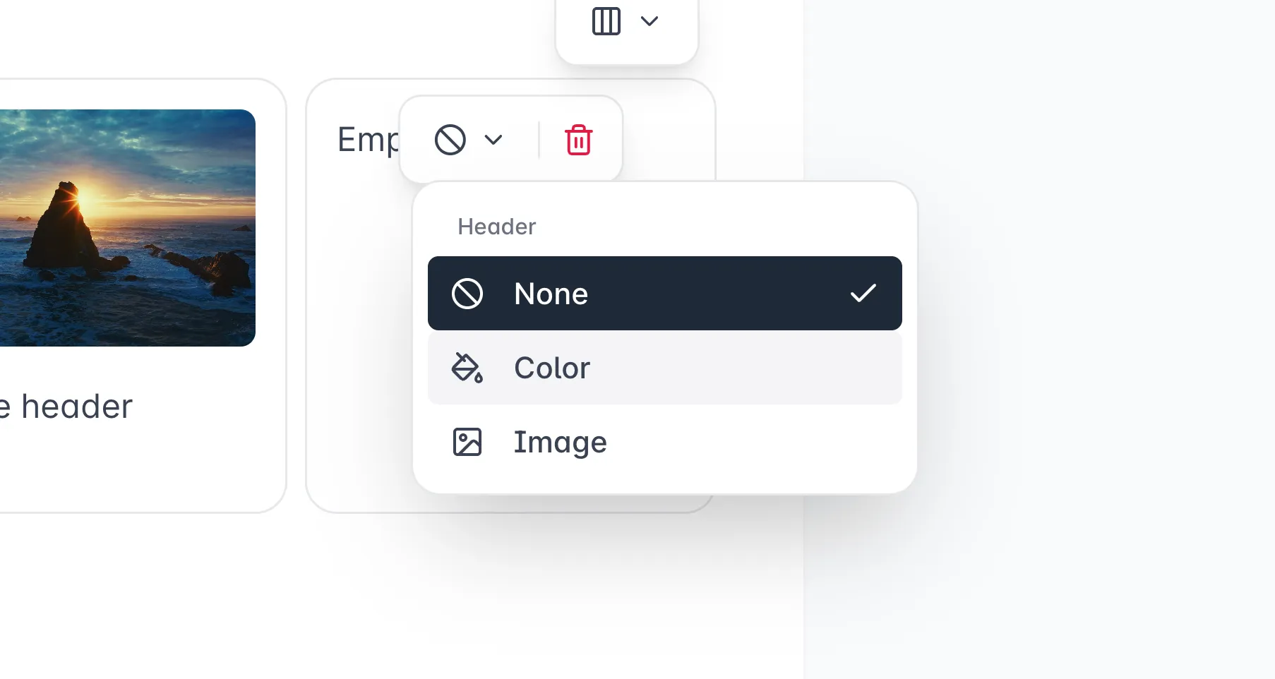
You can use a color as the header to make your card more visible. You can even use code colors to match your features.
Click on the Header Type  dropdown button and select Color
Click on the Change Color and select your preferred color. Any changes made will be saved automatically.
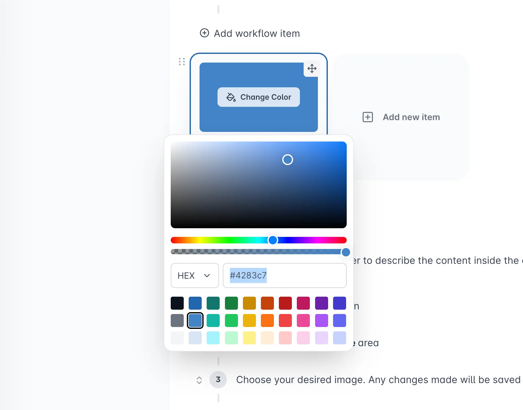
Image header
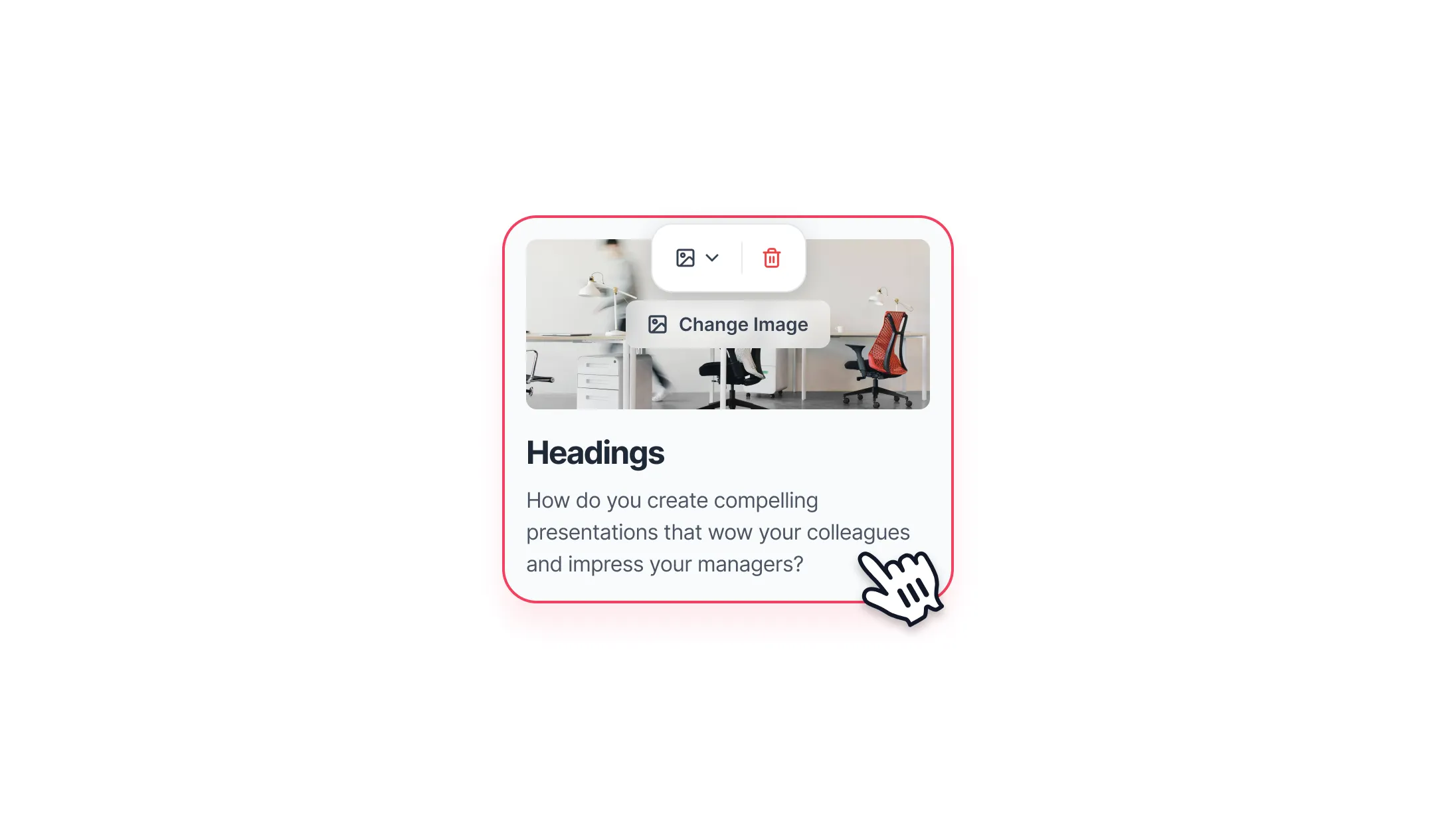
You can use an image as the header to describe the content inside the card and make it more aesthetically pleasing.
Click on the Header Type dropdown button and select Image
Click on the Add Image button
Choose your image. Any changes made will be saved automatically.
Layout options
Items per row - control how many items appear on each row:
- 3 items per row
- 2 items per row
- 1 item per row
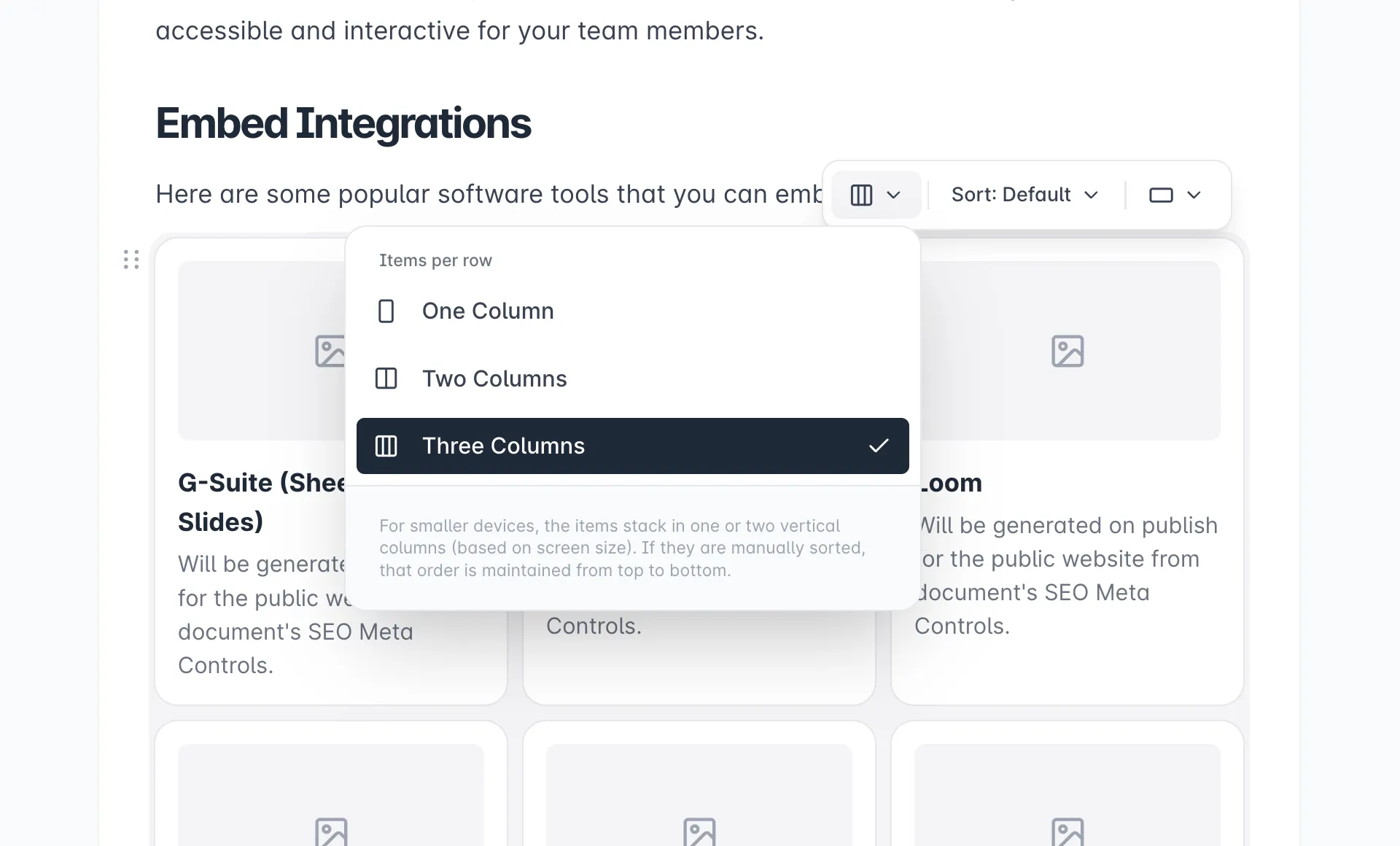
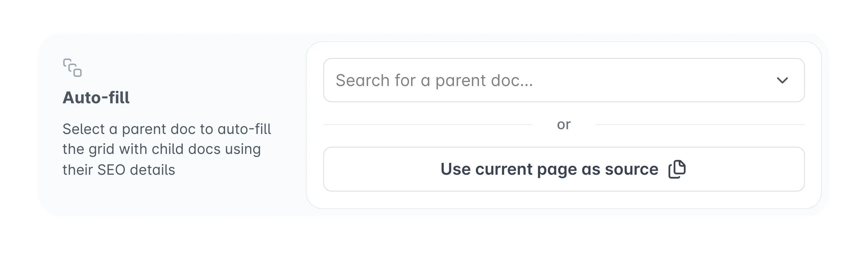
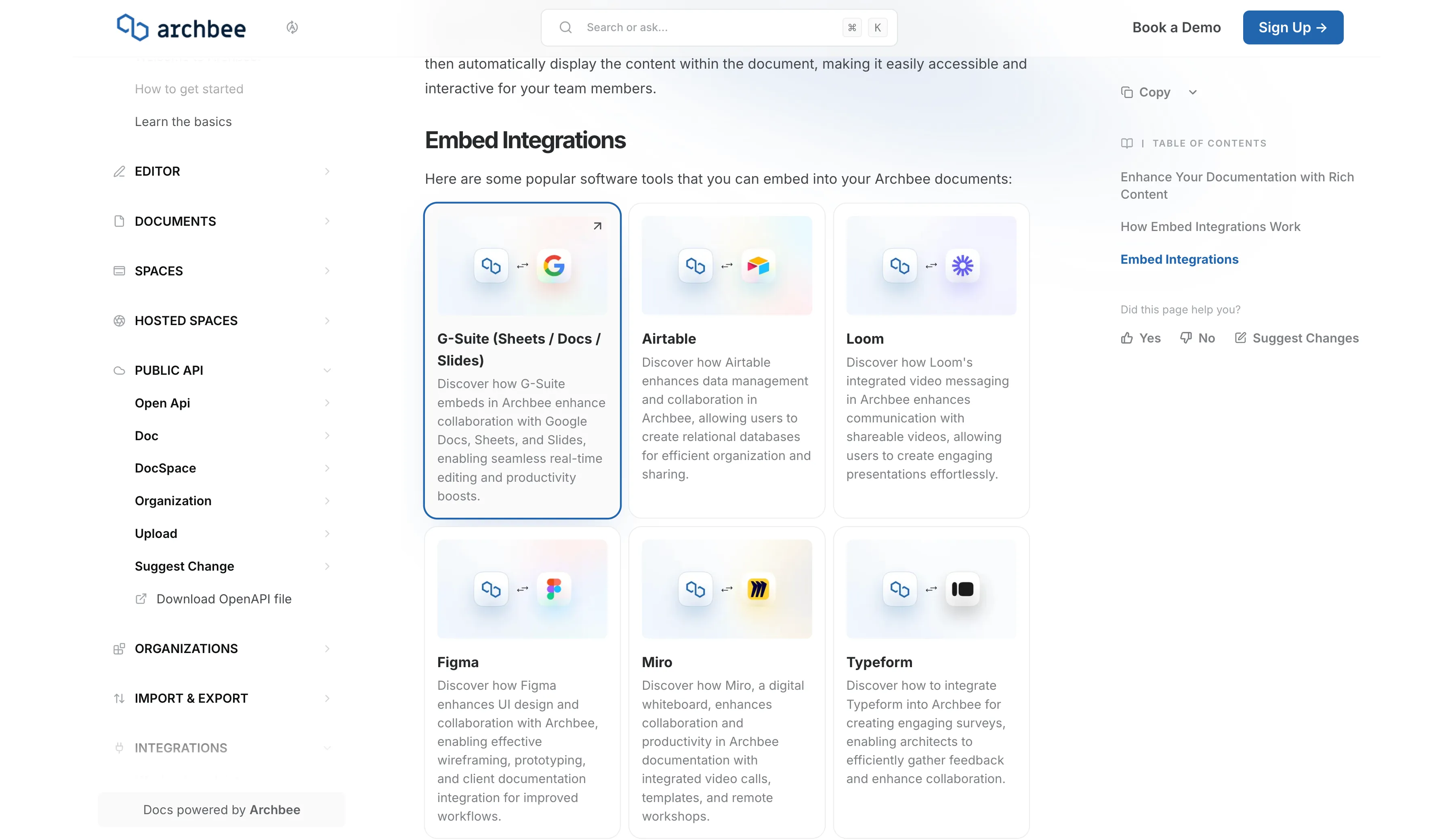
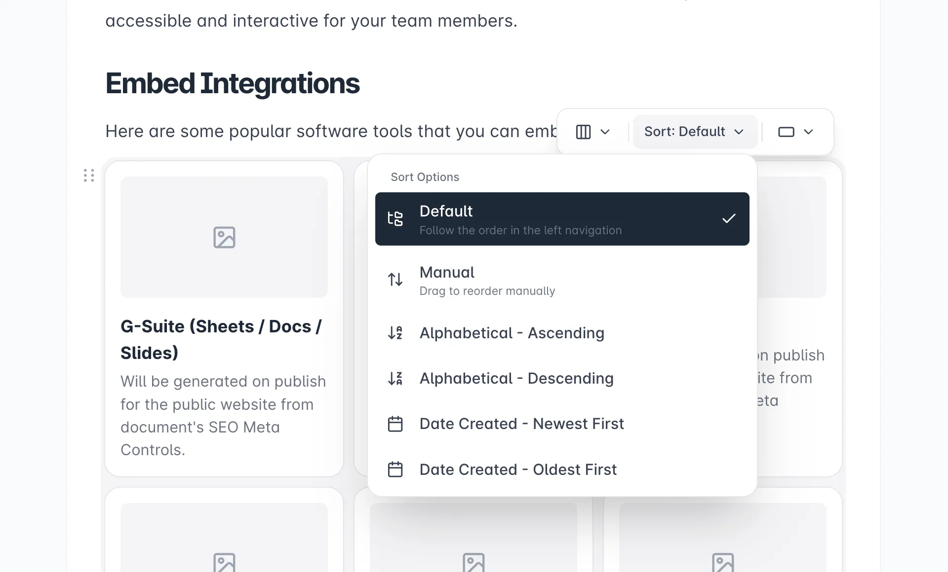
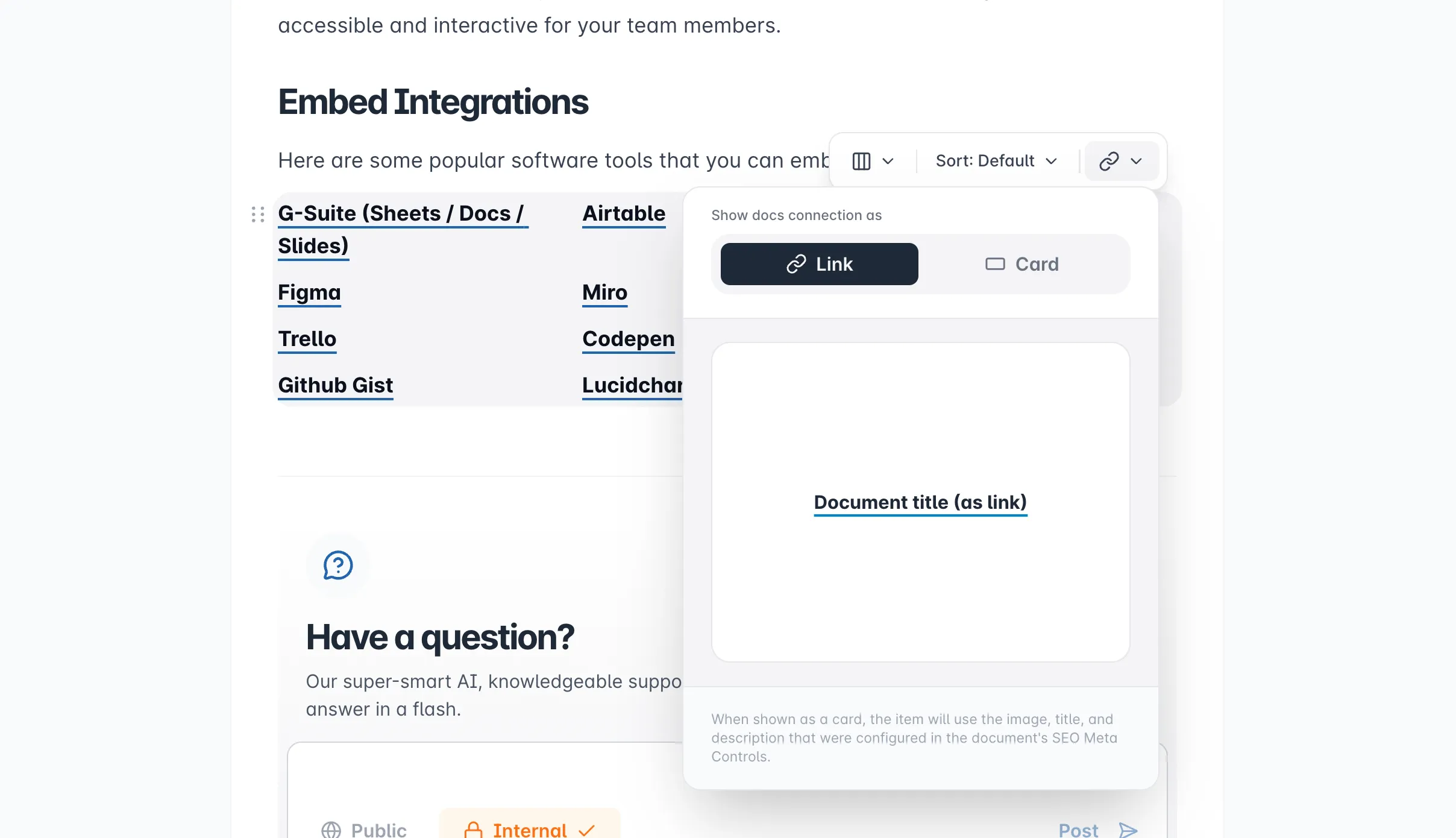
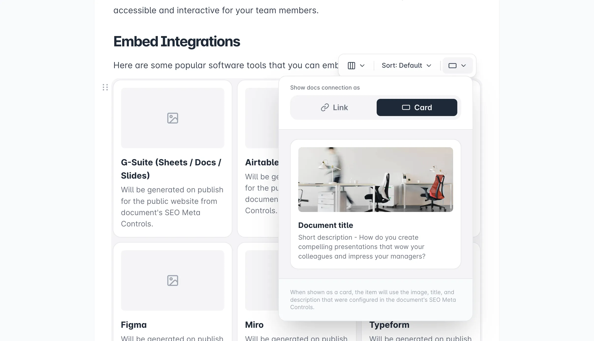
Image Guide
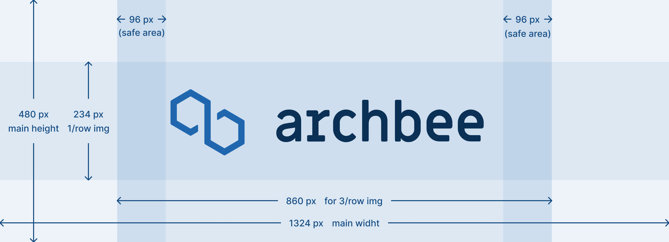
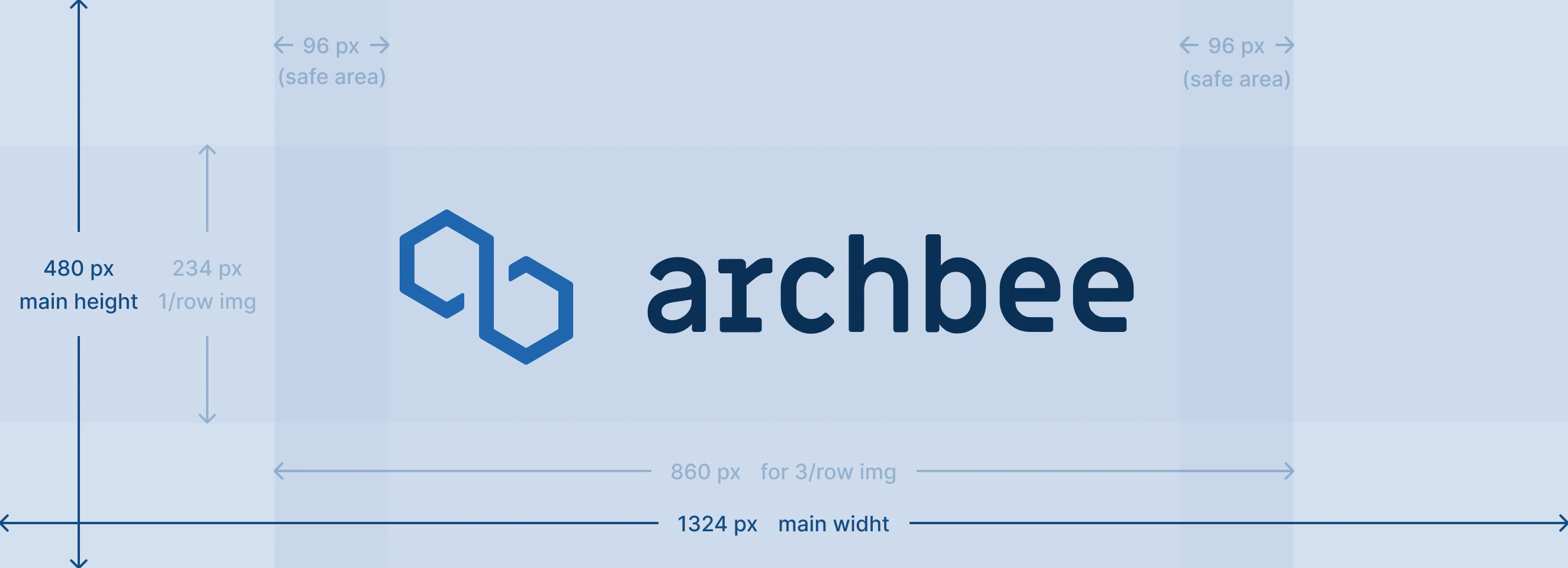
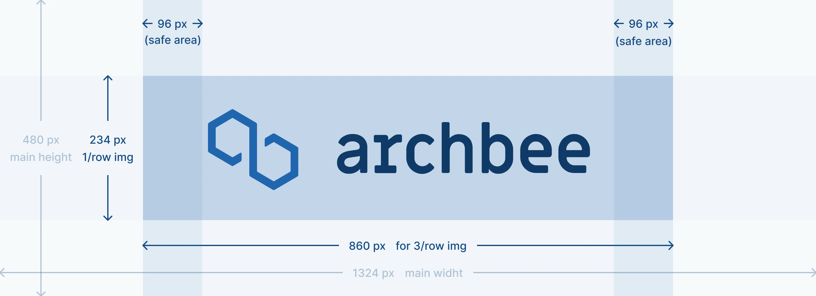
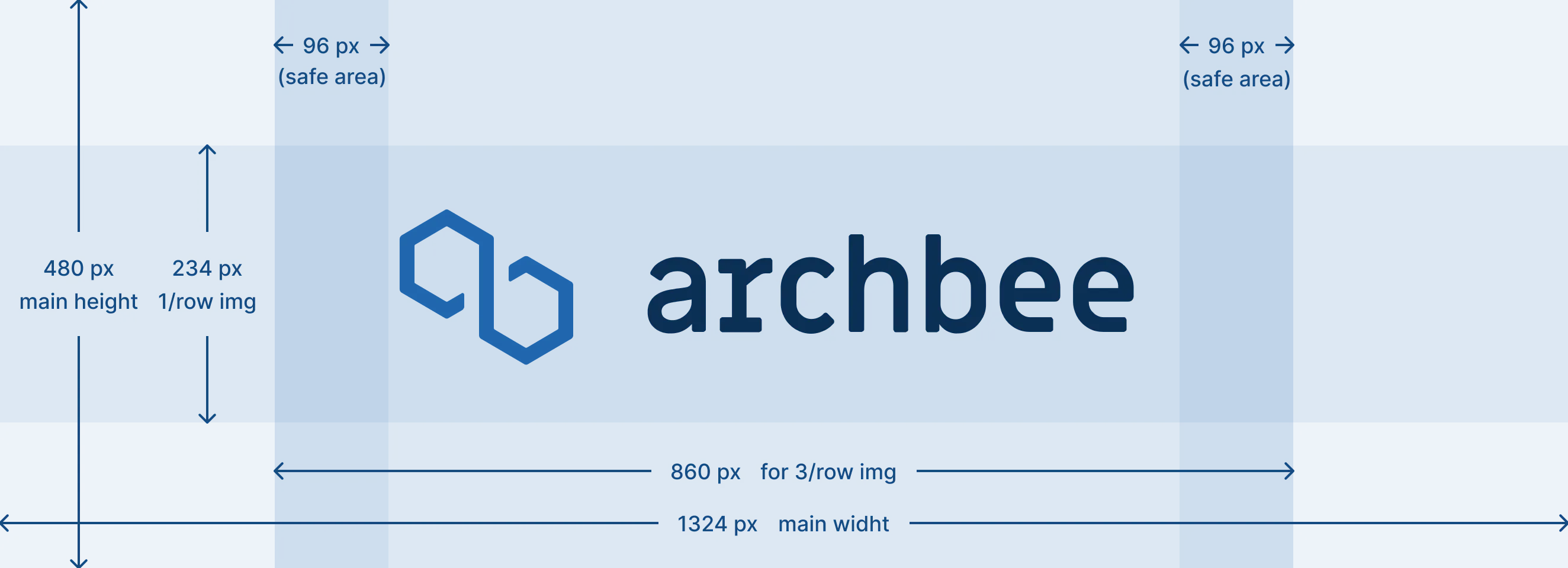
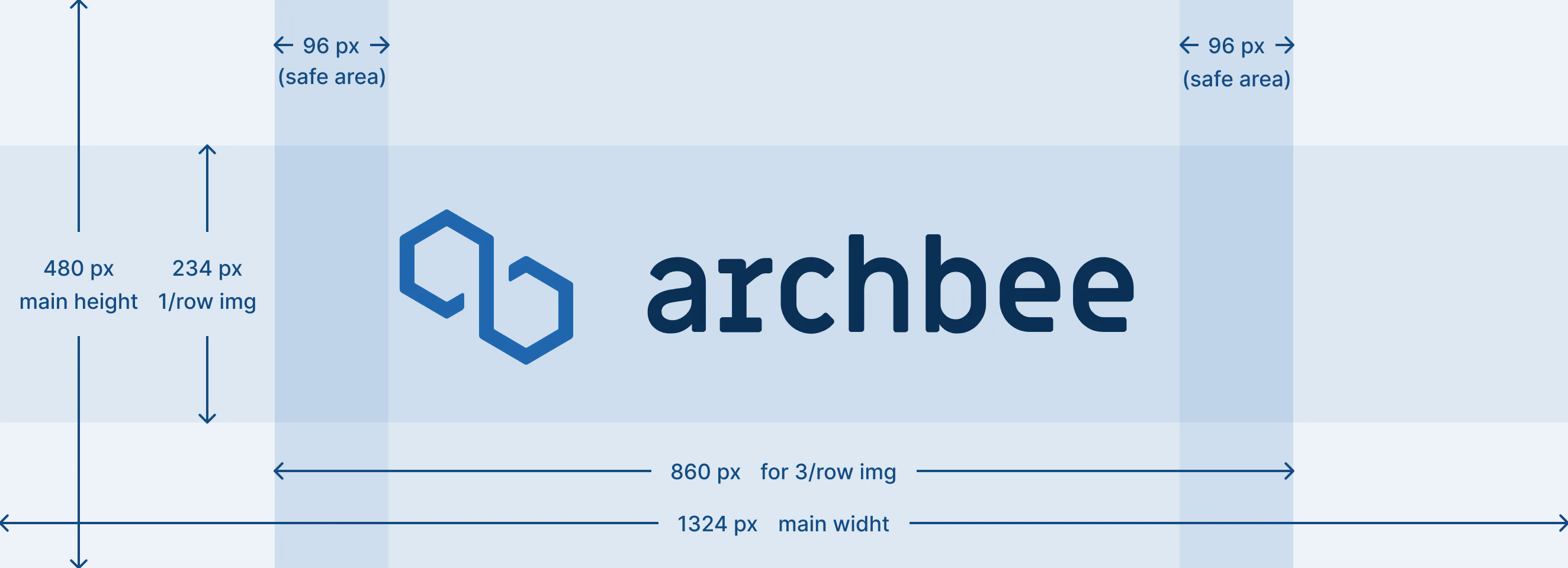
To ensure that your content is displayed properly, we recommend to create an image with a height of 480px and a width of 1324px. By following the visible area guide below, you can ensure that your content is not cut off.
Visible Area Guide
The main image has dimensions of 480px in height and 1324px in width.
In the case of having 3 Link Grids per row, the visible area will be 480px in height and 860px in width. This visible area will be centered within the main dimensions. Please refer to the image below for a visual representation:
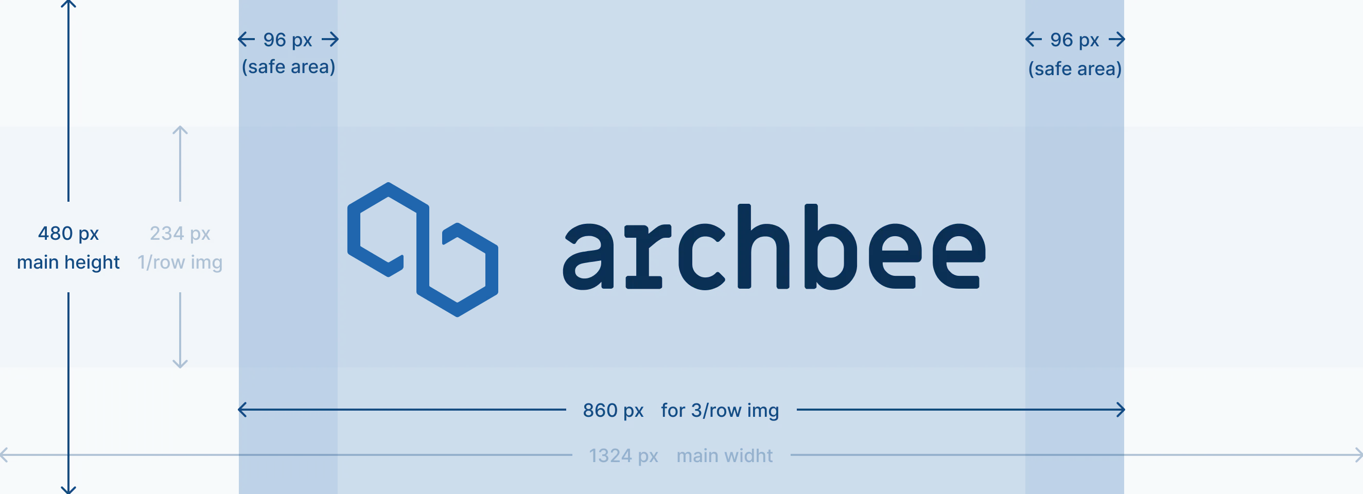
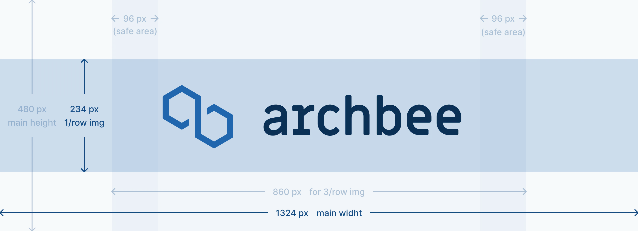
To clarify, the primary content or logo should be positioned in this designated area.
Please find below a live demo how look the cover image and its behavior.
Markdown
Here's how to create a tab in your document using markdown code:
Create the Link Grid Start with the ::::link-array line.
Add a link card Each Link Grid content goes between :::link-array-item and ::: markers.
Choose the headerType You have two options for your header:
- IMAGE: This displays an image as your header background.
- COLOR: This allows you to use a solid color for your header.
Add the appropriate attribute
For IMAGE headers:
- Add the image URL as the value for the headerImage attribute.
- Example: headerImage="https://placehold.co/600x400")
For COLOR headers:
- Define the desired color using a hex code for the headerColor attribute.
- Example: headerColor="#ff00FF"
Add content inside of your link card.
🚨 Attention!
When using the triple colon (:::) syntax to create a nested markdown element, ensure that each parent element above it also has an extra colon (:) before its opening triple colon.
## Link Array - Example

::::link-array
:::link-array-item{headerType="IMAGE" headerImage="https://placehold.co/600x400"}

- list item 1
- list item 2
:::
:::link-array-item{headerType="COLOR" headerColor="#ff00FF"}

- [ ] unchecked list box
- [x] checked list box
:::
::::
Here is the result:

- list item 1
- list item 2
unchecked list box
checked list box
Check the Use Markdown shortcuts page to see more markdown shortcuts for other blocks.
Examples
Examples? For a Link Grid? It's like finding water in the ocean. You can't avoid it. Our docs are swimming with 'em! On this page there are 8 of them, plus images.
Custom CSS
Throughout our extensive experience, we have been dedicated to helping customers personalize their documentation according to their unique preferences. Additionally, we have offered valuable assistance that we believe will also be of great benefit to you in crafting exceptional documentation for your product.
Set link to be sticky at bottom
Set your links inside of the Link Grid to be sticky at the bottom of the card.
<style>
    .ab-link-block-content-wrap .ab-link {
    position: absolute;
    bottom: 0;
    }
</style>
Find other blocks
Discover new ways and blocks to create stunning and functional documentation pages.

Need help? ⬇️
Use the blue chat bubble from bottom right corner.
Or try AI Chat (from search box) for quick answers.

Your opinion matters
Use the below feedback form, anonymously.
Or ask a question in Q&A section and our team or AI will give you a solution.